
A family-owned sushi restaurant based in San Diego, California wanted to demarcate themselves from the many small businesses in the city, an issue they struggled with due to the lack of cohesive branding in their establishment.
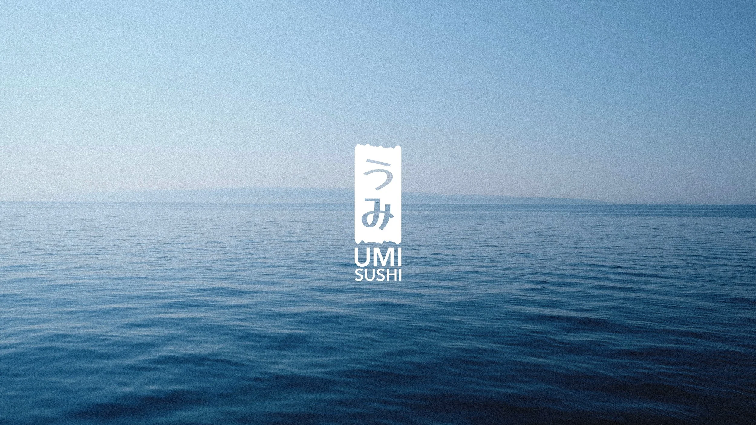
海 (umi): the sea
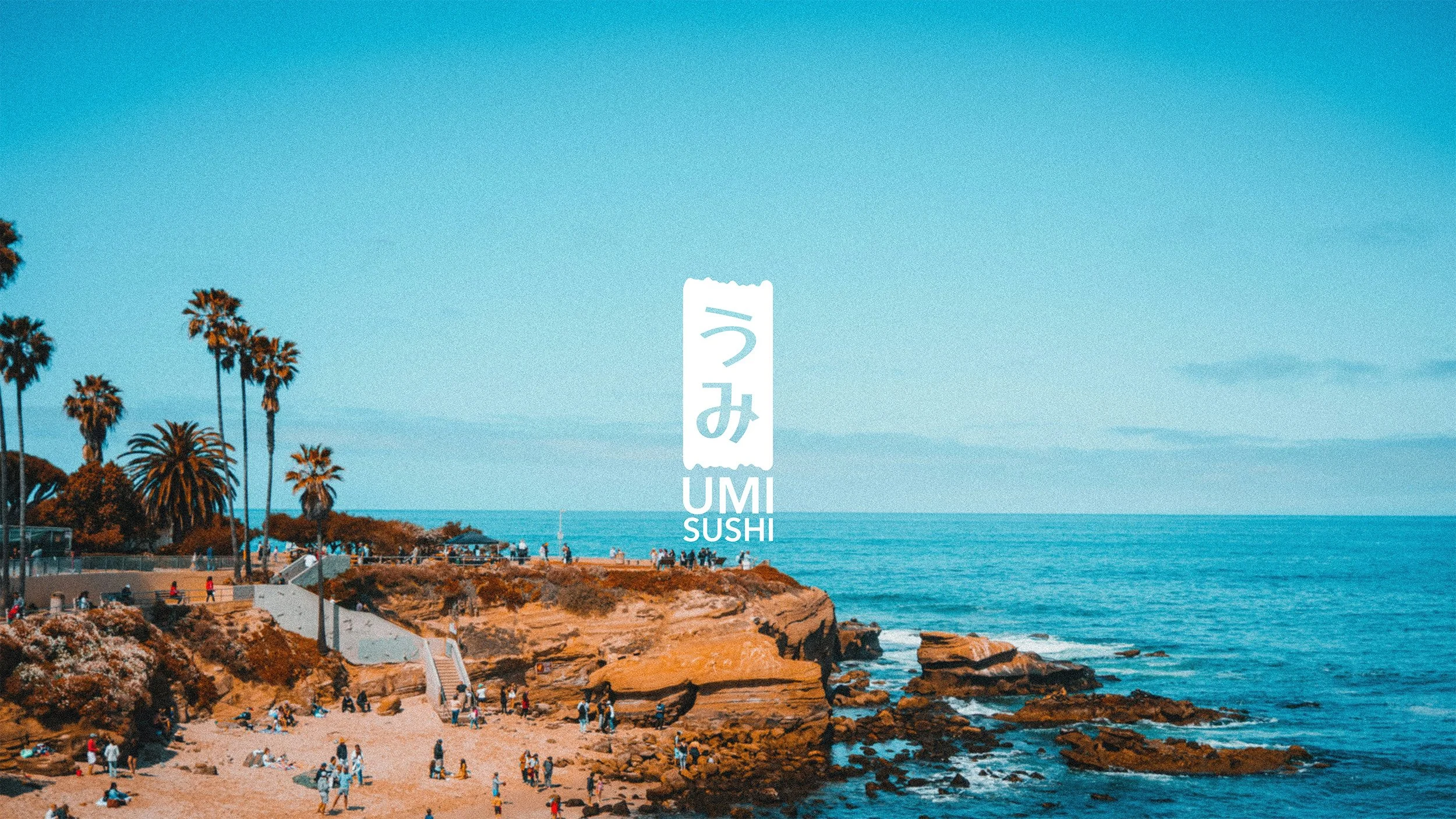
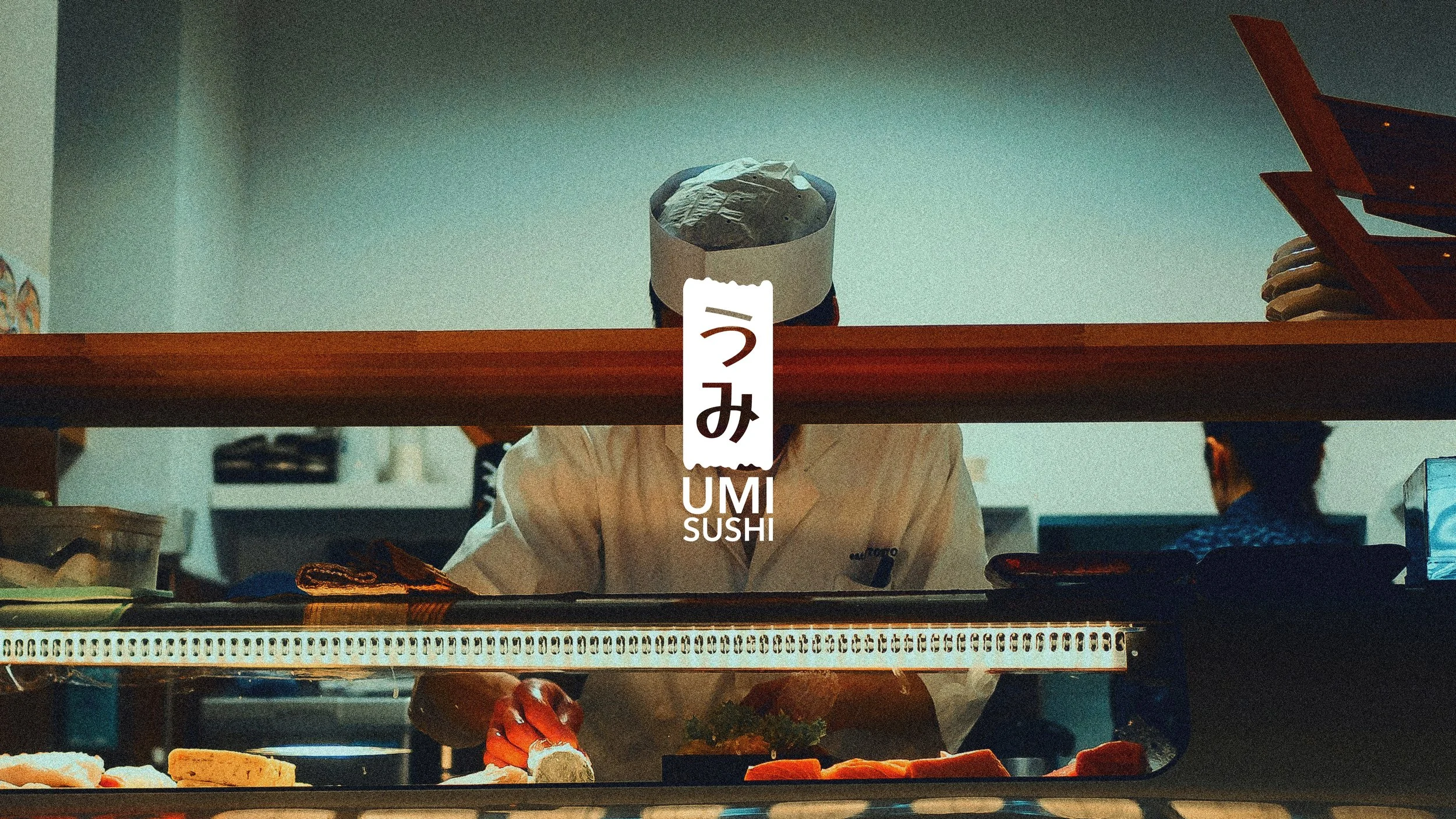
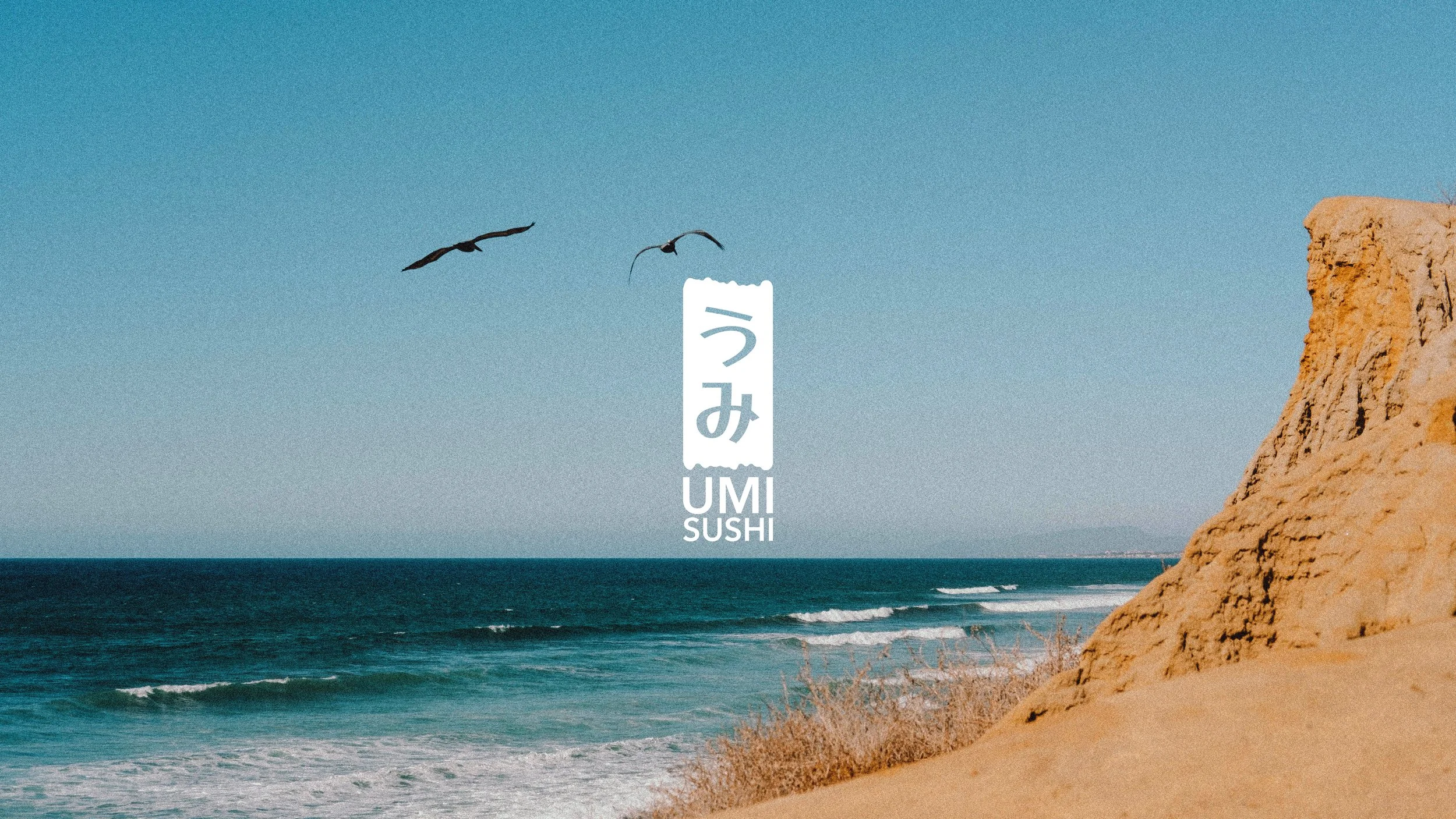
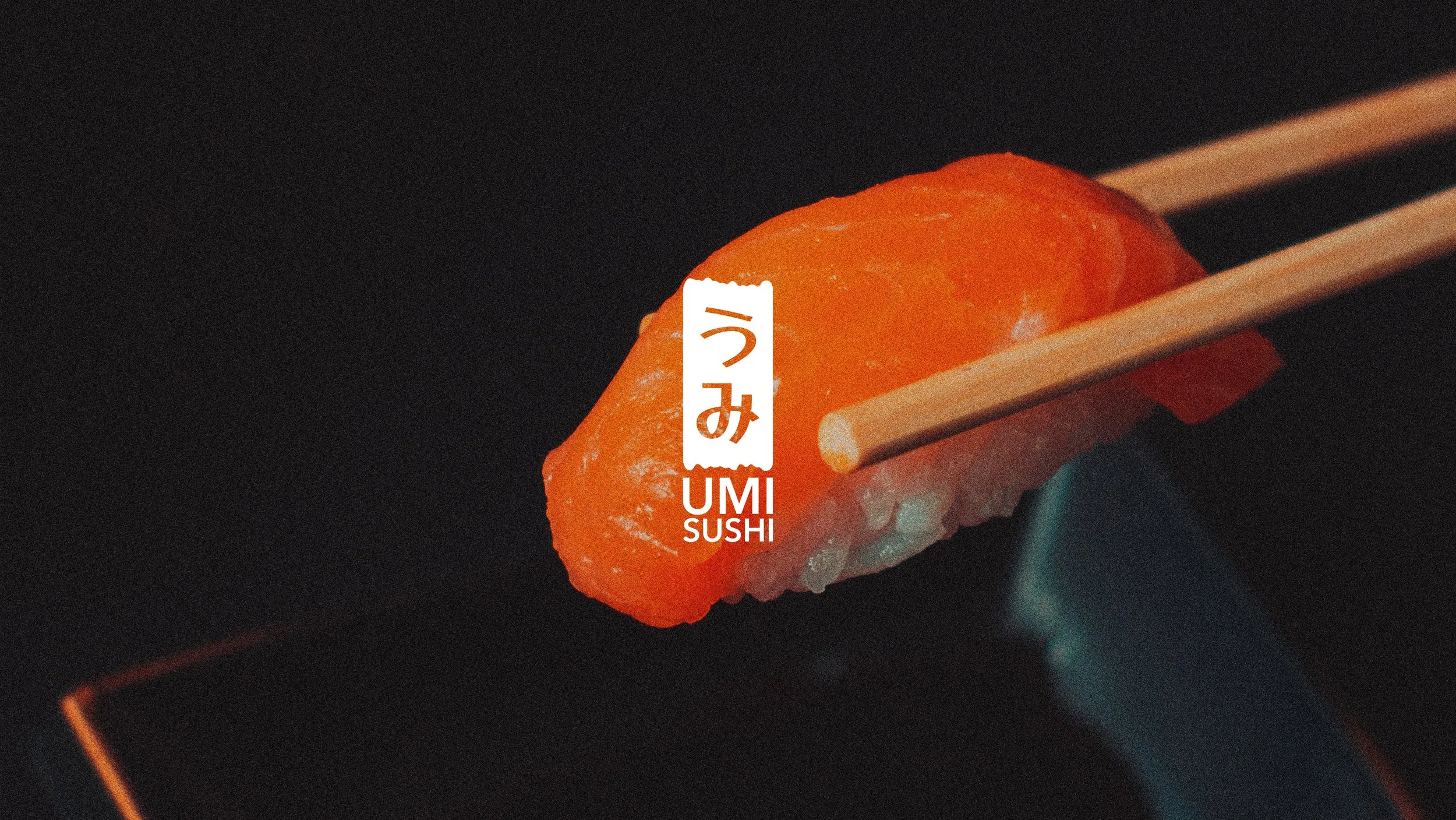
The restaurant is a modest local’s favourite, located near the waterfront in Point Loma. It felt fitting to focus on the coastal theme and to use traditional representations: the color scheme uses blue and its complement orange, water and sand. The logo mimics the shape of Japanese wooden business signs with edges also reminiscing of waves on the beach.
The logo design is minimal and playful, fit for the warm welcome you’ll receive at Umi Sushi on your next trip to the San Diego waterfront.


Matsuri, a summer menu: Emulating retro Japanese graphic design and YSL’s colorful Love posters to tell a moment — visiting Umi for a meal by the sea.


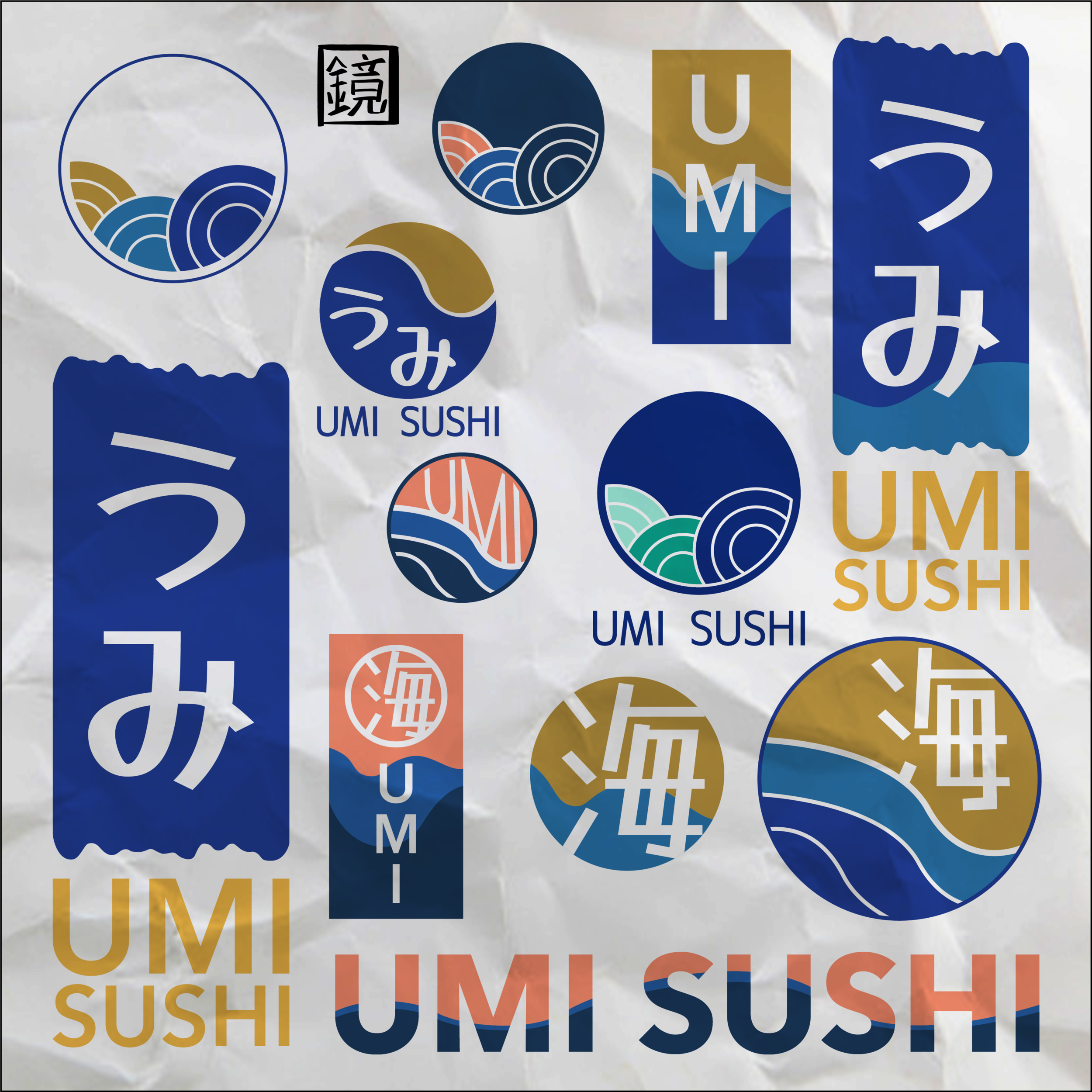
Study sketches:


A website and app for wider reach
Umi Sushi’s original website was to say the least lacking cohesion and personality. A continuation to the branding project for the restaurant, this time showcasing web design and prototyping skills!
Features include ordering pickup/delivery but also on-site while sitting at the restaurant (for the app only), view the menu and the restaurant’s latest news, all sporting Umi Sushi’s new brand identity.
Test the prototypes:


